Friday, 4 May 2012

Evaluation Questions 2,3 and 4

How effective is the combination of your main product and ancillary texts?
The combination of the three products works very well together. At the very beginning of the project I chose my colour scheme of red, black and white through inspiration from Alfred Hitchcock, and kept this up throughout all of my products. For additional continuity I used the same fonts for each of them and kept the original logo for ‘Instinct’ that I had made on Photoshop. I repeated the tagline of ‘sometimes a mothers’ intuition just isn’t enough’ as this is memorable and accompanies the title of the film. It makes it memorable for a reader and also gives a little bit of an insight into the film and its storyline. I also made sure that the actress I used for the teaser trailer was the same as the one featured on the front cover of the magazine.
Looking back the only problem with this was that the actress wore different clothes for the tasks, however I believe I rectified this slightly by presenting her as an actress as opposed to just being the character from the film. I also think that the teddy bear from the poster could have been included somewhere in my teaser trailer or film magazine cover as it only appears once and could provide significant symbolism for the film.
Overall I think the main product and ancillary tasks work together well and have produced a package that could successfully promote a film.

What have you learned from your audience feedback?
Throughout this process I have relied on a lot of audience feedback for all of the tasks via email, Facebook, Slideshare and online surveys. I have learned that in order to produce a product that is well-received by the majority, it is very important to first listen to audience feedback to notify whether or not anything seems unclear or is less effective. The target audience for this project is aged fifteen and over and so I made sure that the majority of my audience feedback came from this age range as well as some from an older generation.
I used the feedback to alter my work however I found that in some cases there were divided opinions and so used either further research from a wider audience or used my own judgement in the hope of producing the best product possible.

How did you use media technologies in the construction and research, planning and evaluation stages?
I used a wide range of resources for my project. My blog was made using Blogger; I used YouTube to research existing film teaser trailers and to upload my own product; I found Slideshare very useful to incorporate my PowerPoint Presentations smoothly and easily into my blog; Prezi and MindManager allowed me organise my ideas and thoughts easily and present them in a professional way; for producing the ancillary tasks Microsoft Publisher  and Photoshop proved the most useful I could edit the images and form the tasks on there; piecing my film trailer together and editing was all done in Sony Vegas Pro; I used my own camera to film the teaser trailer; and I used emails, an online survey website and Facebook to get audience feedback.
Over the course of the project I feel that I have sufficiently used a wide range of media and my skills for all of these have developed significantly. I am now more aware of what software to use for certain tasks and am able to apply my knowledge as much as I can.

Evaluation Question 1

Here is my presentation regarding question one of the evaluation. I have uploaded it onto Slideshare.
In what ways does your media product use, develop or challenge forms and conventions of real media products?

Poster
Whilst conducting my research I discovered that there were only a few conventions as they all varied from being very busy and full to being very simplistic. As a minimum requirement there should be a limited amount text, an image relating to the film itself and a title. As I didn’t want to give lots of detail about the film away, I thought that by sticking with this minimalistic approach I could produce a successful and intriguing poster.
As I have shown in my mind map I thought of what images I could include in my poster that related to the theme of the film. I chose a teddy bear as it links in with the theme of babies and provides very little insight into the film itself.
I added small print information as is seen on the vast majority of posters which details the production team for the film. Once I had added the title ‘Instinct’, I felt that my poster was a little too minimalistic and so carried out more research and looked at other pieces of text that might appear on it. I was very conscious about the amount of text as the purpose of a poster is to draw a passer-by in, and lots of unnecessary text can be off-putting. I created a tagline for the film title which I later used in my magazine front cover, and also included a release date along with the names of actors that would appear in the film. I spread the text out, again to avoid the appearance of too much text. I only used two fonts so the final piece looked more professional and was easier on the eye.
At the bottom of the poster I used a film certificate logo which doesn’t always appear on posters however I had noted that it should be included in at least one of my products.
I think that on the whole the development of my poster has followed the majority of the conventions of a good poster however I know that in some cases the lack of information given out may prove misleading for a viewer as opposed to captivating.

Teaser Trailer
When looking at other teaser trailers for the genre of horror, I managed to draw lots of ideas and inspiration from them. Teaser trailers should be between 30 and 90 seconds long and not give too much away about the film itself. My teaser trailer is 77 seconds long, and through the use of quick editing I feel it gives just enough information to an audience. As is seen in many teaser trailers of this genre, the purpose of such little information is to build suspense and allow the audience to become drawn in and want to watch the film. In my trailer I created a tense and mysterious atmosphere by using a shot which got closer and closer to a door with the final shot being the silhouette of an arm reaching for the door handle. This leaves an audience questioning who or what is behind the door, prompting them to watch the film to find out.
I discovered that teaser trailers are usually fast-paced yet my product isn’t. I challenged this convention as the music I had chosen was slow and I felt that it wasn’t befitting for such editing. I still think that my teaser trailer works as the slower music builds the tension and forms and eerie atmosphere.
Stereotypical trailers for horror films are gory and contain lots of running or screaming. I wanted my product to get away from this and not appear to be clichéd. My teaser trailer relies purely on the unknown, and the ‘scare factor’ comes from the main character being an ordinary mother in a homely setting - something an audience can relate to.
Many trailers have small pieces of text embedded between camera footage. I liked this idea and decided to incorporate it into my own trailer. I chose my words carefully to enhance the suspense whilst making sure that it didn’t detract from the scenes.
Overall I feel that my product complies with most of the conventions of a successful teaser trailer and despite me challenging them slightly I still think it is an effective piece.

Magazine Front Cover 
The front cover of a magazine has several features and conventions which I stuck to as I found that there were rarely any exceptions to these rules whilst conducting my research. A left-third of a magazine is perhaps the most important as it is predominantly what is first seen by a viewer when in stores. I made sure that the left third on my magazine front cover was insightful and featured the most important parts of the magazine. These included part of the masthead which would be instantly recognisable to a reader; buzz words such as ‘free’, ‘plus’ and ‘world exclusive’ which entice the reader; coverlines with larger bright headings that look attractive and instantly give snippets of information about the content of the magazine; part of the skyline; and the dateline so it is instantly obvious that they are reading the most up-to-date issue.
I wanted to include as many other features of a magazine front cover as I possibly could and so I used a skyline to further advertise and promote the magazine and its contents; a large main image using a mid-shot with eye contact to involve the reader; a large main coverline to accompany the image; a bright button to give a little more information about the magazine and its highlights; a website for the magazine to invite more interaction and feedback from the readers; a review quote to encourage the reader to investigate further; and a barcode.
In my first draft of the magazine front cover I attempted to challenge a convention by using a black background as I did in the poster. However I found that a white background made the main image stand out much more and could see how much more effective it was. I kept with a set colour scheme and allowed the main image to stand out even more by adding a red shadow behind it.
The main image was airbrushed as it would be for any other magazine front cover, however despite my I.T skills developing substantially since the beginning of the project, I still find that the image could be perfected even more with other software.

Conclusion
To conclude I am happy that each of my tasks successfully meet with many of the forms and conventions I discovered during my research. I believe that where I have challenged or developed them, I have done so effectively and with sufficient justification.
I worry slightly that my poster may be a little vague but I feel that the symbolism of the teddy bear and the logo that accompanies it is effectual and links in well with the theme and plot of the story as well as the other two tasks.

Thanks for watching

Wednesday, 2 May 2012

Time Plan

I am pleased to upload a copy of my completed timeplan with every task I needed to do completed in the timescale I set myself :)

Friday, 27 April 2012

Teaser Trailer Editing

In order to piece my film clips together I used a software called Sony Vegas Pro. This was new to me as I had previously only used Windows Movie Maker however through practice and trial and error I managed to produce the final product with the appropriate effects and transitions that I had in mind on my storyboard.


The first image was created in Microsoft Publisher and is a conventional feature of film trailers as it tells and audience its age restrictions and content. I found an example of one on the internet and used this as a guide so I knew what colours and type of text to use.


Following this I watched all of my footage and cropped it to choose much smaller snippets of the film which were most important and relevant to the plotline. This took a long time as I had filmed lots of different types of shots and angles, and I had to decide which were the most effective whilst still keeping them varied. I put them in the correct order and muted the videos so I could add sound on.


As it is a horror film trailer with the purpose of frightening an audience and having them on the edge of their seat I edited the lighting of each of the video clips by decreasing the opacity. This gave it a darkened appearance whichI feel is much more befitting for a teaser trailer of this genre.


The sounds I chose came from www.freesound.org, a royalty free website full of sound clips and music for every mood and genre. I had already decided that I wanted an eerie sound of a music box playing in my teaser trailer as this relates to the theme of babies. I also used the sound of a babies cry as this can be seen as a most distressing sound. I then looped the sounds to make them long enough for the duration of the trailer and put them together to sound like one longer track.


As the film clip of appraching the door appears several times within the trailer I decided to slow down the speed of this clip to create more suspense. This looked most effective on the final scene when the audience sees the silouhette of a figure reaching for the door handle. I slowed down the speed oof the very first scene too, as it is a happy image and represents how this characters life was before the horrible and mysterious things begin to happen.


The text I used between shots was created in Photoshop. I chose a font similar to the one I used for my poster and magazine front cover and used a bright red with black background which ties in with my colour scheme throughout. I then saved these individualy and inserted them as images into Sony Vegas Pro. To give a zoomed effect I increased the size of the image and animated this, making it look as if the text is coming towards an audience. I also created a smokey effect by inserting a media genrator called 'Marble'. I changed the background of this effect to transparent and its foreground to red. As the original effect was vertical I flipped it on its side to make it horizontal and appear as if the text was seeping out through the smoke. I changed the progress to 'animate' and edited the speed to slow it down. The final text slide used the logo of 'Instinct' that I had used throughout my tasks and the same effects were applied to this.


Finally I inserted transitions between each of the clips to give it a smoother finish and make it look much more professional. I used the 'fade through black' effect as this is the most conventional for film trailers.

Tuesday, 24 April 2012

Film Teaser Trailer


This is my final film teaser trailer.
Enjoy!


I have also posted the trailer on YouTube:

Thursday, 19 April 2012

Sound

The sounds I wanted to use have to either be mae by myself or taken from royalty free msuci websites. As the software i have access to is limited and i am not quite familiar with its use, I chose to browse through different websites to find the sounds I wanted. I found that http://www.freesound.org/ was the most useful and this is where I got all of my sounds from. The babies cry was very straight forward to find however the main soundtrack to the trailer was more difficult. Using my mindmap I searched different key words such as 'eerie', 'nursery rhymes' and 'horror'.
I eventually came across the sound of a ropey music box which gave me chills and so decided to use this throughout my trailer. It wasn't quite long enough to accompany all of my footage so I looped it on the Sony Vegas Pro software and it finished at the right place. I slowed the song down a little to make it more creepy and feel that its connotation of being quite jolly juxtaposes the chilling atmosphere of the horror film.

Monday, 16 April 2012

Actor Profile


Name: Sarah Barden
D.O.B: 28.10.1993
Age: 18
Profession: working actress
Nationality: British
Place of Birth: Shrewsbury
Education:
- Shifnal Primary School
- Idsall School
- Idsall Sixth Form
Height: 5ft 6
Hair colour: light brown
Eye Colour: blue

I made the actress look more like a mum in the film trailer by dressing her in ordinary attire - jeans and a t shirt. She wore minimal make up and her hair was simply clipped in a no-fuss manner. I believe this is an accurate representation of a modern day mum and is something that an audeince would be able to relate to.

Friday, 13 April 2012

Prezi Teaser Trailer Storyboard

When I had drawn my first storyboard on paper, I discovered that some of the shots didn't have the same effect and so I created this Prezi Presentation to show my new and improved storyboard for my teaser trailer in chronological order.

Wednesday, 4 April 2012

Camera Shots & Angles Research

I carried out research on different camera shots and angles that I could use in my teaser trailer. I found these websites very useful and also found a SlideShare presentation which gave lots of information about additional things to consider when filming such as continuity. I hasten to add that I DID NOT MAKE THIS PRESENTATION, I merely used it for my research and to gain more knowledge in order to make my teaser trailer as good as it can be.
http://www.mediaknowall.com/camangles.html
http://solematesfilm.blogspot.co.uk/2011/01/research-camera-shots-angles-and.html

Tuesday, 3 April 2012

Teaser Trailer Mindmap

Again my ideas are clearly set out using a mindmap regarding everything I need to consider when making the teaser trailer.

Monday, 2 April 2012

Facebook

I created a page on Facebook onto which I uploaded my products and requested feedback from a selected audience. Here is a link to this page:
http://www.facebook.com/a2mediainstinct

Friday, 30 March 2012

Easter

I shall continue to post again properly after the Easter break. Have a lovely Easter!

Wednesday, 28 March 2012

Final Draft of Magazine Front Cover Analysis

This is an analysis of the final draft of my film magazine front cover.

Tuesday, 27 March 2012

Film Magazine Cover Final Draft

This is my final draft for the film magazine front cover. At first glance it is dramatically different as I chose to go with the convention of a white background as opposed to the previous black one. The feedback I got was that this convention works as it makes the main image and text more bold whilst still being in line with my chosen colour scheme. The font of the rest of the text links in much more with the poster and the genre of magazine and I believe this looks less daunting for an audience. All the original features I had on the first draft still appear, I had merely changed the positioning of a few of them e.g. barcode, price and date line. I have given the main image a red shadow, again tying in with the colour scheme as well as making the image clearer and stand out more.
Overall I am satisfied with the adaptations I have made to produce this final draft of a front cover for a magazine.

Wednesday, 21 March 2012

Film Magazine Cover First Draft

Here is the first draft of my poster which I hope to gain feedback for and improve later on.
For this piece I kept the black background to link it to the poster, despite this not being a conventional idea. I still used the colour scheme of black, red and white for continuity and used similar fonts for the coverline as the poster. The positioning of all of the text and image is similar to that of any other magazine front cover and I used many of the conventional features. The logo for 'Instinct' has been kept the same as I feel it tells a lot about the genre of the film and is recognisable when seen in the poster and teaser trailer. I believe the red and white font stands out very boldy against the dramatically dark background and the font of the title is befitting for a film magazine. I am pleased with this first draft, but still believe it needs to be altered as in comparison with existing film magazine front covers, it isn't as effective or attention-grabbing.

Friday, 16 March 2012

Editing In Photoshop

Whilst making my magazine front cover I chose an image to edit and incorporate. Not only did this help my product look more professional, but it also developed my skills in using a variety of softwares. I used Photoshop and below are two parts of a Powerpoint Presentation which described what I did and how. I also uploaded this onto Slideshare.

Monday, 12 March 2012

Barcode

One of the features of a magazine front cover is its barcode. Instead of simply selecting one from the internet, I decided to make my own using the Paint software on the computer. This gave me more experience in a wider range of technologies.

Thursday, 8 March 2012

Images for Magazine Front Cover

I had a lot of fun taking the pictures for my magazine front cover. Below are a range of shots that I took from different distances and angles so I had lots of choice when it came to choosing one. I placed each of them on a template for my poster to see roughly which one looked most effective before deciding on the final one. I drew inspiration from existing magazine covers and looked at how the models on these were presented through a range of poses and shots.

long shot, showing sadness

high angle shot, shows vulnerability

mid-shot

long shot

long-shot, similar pose to that seen on existing magazine front cover

close-up

long-shot

close-up smiling

long shot

long shot, smiling

mid-shot looking away from camera, showing vulnerability

long-shot looking away from camera, showing vulnerability

mid-shot looking at camera, smiling

mid shot lookimg a camera

close-up, looking at camera

mid shot lookig away from camera


this is the image I chose. it is a long-shot to see more of her and she is looking at the camera to draw the audience in


Friday, 2 March 2012

Magazine Front Cover Mindmap


I used this software again as it really helped me to organise my ideas in a simple way. This mindmap contains all my thoughts about my front cover of a magzine.

Friday, 24 February 2012

Existing Magazine Analysis

To gain a better understanding and knowledge of what a successful film magazine front cover should look like, I found an existing one and carried out an analysis.

I found that this magazine front cover has a conventional layout with the left third, main image, masthead and cover lines etc. I wish to keep to these conventions as they seem to be the most effective.

Tuesday, 21 February 2012

Final Draft Of Poster


When reevaluating my first draft I felt that the white background made the poster look rather washed out as the picture was faded and the eye was first drawn to the text at the bottom of the poster. I wanted to change this and so I made the background black to represent danger and fear. I recoloured the image of the teddy bear to be white which made it stand out so much more. I used the same bright red for the most important information on the piece and changed the small print to white so it was still visible on the page. I looked at other modern posters and found that mine didn't have a release date on it. When I added this text I made it red as I thought it was a profound piece of information. However at a glance it appeared that there was too much text which would prove a hinderance to passers-by as it would be too much to consume. I then moved the actors names onto the top of image as opposed to underneath it to break up the text more. I made the small print even smaller and spaced out the lettering of the release date to create the illusion that there was even less text.The font for the tagline was also quite large and bold and I changed it to be thinner so it didn't appear to be competing with the main title. I feel that because the fonts were fairly simplistic and not typical horror fonts such as 'Chiller' it gave the poster a sense of mystery whilst the colour scheme and title still gives the genre of the film away so people who enjoy such films would know instantly that the film would be of interest to them.

Overall I am very pleased with my final poster as I feel it successfully carries out the intention of informing a viewer whilst not overloading them with unnecessary information.

Friday, 17 February 2012

Monday, 13 February 2012

First Draft Of Poster

Once the poll helped me to decide which image to use I experimented with background colours. My chosen colour scheme was red, black and white and so these were my first choices. In my first draft I used a white background with the image of the teddy in a dark grey. I used black and red coloured text and kept to three fonts - one for the tagline, one for the actors names and one for the small print at the bottom. As the text was minimal and the fonts were fairly similar it made the poster still look just as effective without being repetitive or too busy. Text on a poster should be minimalistic so as not to provide offputting or daunting to a passing viewer. I think I achieved this successfully by listing only three key actors - which could be perceived as a persuasive device by name-dropping; the main title and tagline that is deliberately short and to the point without revealing too much of the plotline; the small print which isn't read by the viewer but is there as additional information should a reader want to know about the production team. I positioned all of text together so it became separate form the image. I also used an age certificate as another important piece of information that can be obtained from a glance.

Friday, 10 February 2012

Wednesday, 8 February 2012

Poll For Poster

I kept in line with my original idea of using one item to represent the theme of a child as the main image. Therefore I chose an old teddy and used a tea bag and sandpaper to make him appear worn. I then discovered that even with the changes I had made in the appearance the image didn't fit with the horror genre which could have been confusing for a viewer. Therefore when I used Photoshop I scoured through a range of effects that could be used to enhance the image and make it look more professional and eerie. I narrowed it down to five which I liked best (as seen below) and used a website called freeonlinesurveys.com, creating a poll for people to vote for which they liked best. Here is my existing poll.
http://freeonlinesurveys.com/app/showpoll.asp?sid=javf1ww6mzh7hpp45008&qid=45008
Which looks most effective for a horror film poster?

Powered by FreeOnlineSurveys.com
cutout0%
notepaper0%
poster edges0%
stamp0%
watercolour0%
Create your own poll
Thank you for voting :)


Saturday, 4 February 2012

Title

For my poster I have chosen the colour scheme of red, black and white - following the same ideas as Hitchcock. Therefore I knew I wanted my main film title to be red, fitting with the colour scheme and stading out moreso than the other information. I thought up the title of "INSTINCT" as it is short and doesn't give much away. It also relates to the theme of a mothers' instinct within the plot concerning a baby's cries. As it is a horror movie the connotations of the colour red are blood, anger, danger etc and so I had the idea of making the title look as if it had been written in blood. I used a Photoshop to make the film title and then narrowed my creations down to four possibilties:


I emailed all of the above around and asked people to tell me which they preferred resulting in me choosing this one:
In Photoshop I used a smudge tool, and simply went over each letter with it to create a less neat text. I feel it makes an eerie image which is befitting for the genre of the film.

Thursday, 2 February 2012

Poster Ideas Mindmap

In addition to a brief plan of ideas for my poster I decided to create a mindmap to display my ideas in more detail. I found that the layout is much easier to follow and shall assist me greatly when I come to create my poster. I used a programme called MindManager Smart and my final mindmap is pictured below.

Friday, 27 January 2012

Poster Ideas

Imagery
I would like to keep my film poster fairly minimalistic so it will keep the viewers guessing about what the film is about. Therefore I am going to choose a single item that will represent an aspect of the plot. For example I have in mind using something that symbolises the use of a babies cry such as an old teddy, rattle, dummy, doll or mobile. I also thought of using a tape recorder or weapon with blood on to represent details of the murder.
I may use two of these ideas to give more of an insight into the film whilst maintaining suspense and curiosity for the reader e.g. bloodstained doll; teddy sat on a tape recorder.


Film Title
I haven't yet thought of a title for the film but looking at other films it seems that single-worded titles are very common and appear to work well as they reveal very little about the film itself, adding to the suspense. I am thinking of relating it again in some way to theme of babies, perhaps a play on words surrounding a nursery rhyme or well-known phrase.


Colour Scheme
I would like to keep to a very simple colour scheme so as not to prove off-putting for a viewer. Alfred Hitchcock generally kept to black, white and red which was very effective for horror films as black represents dark or fear and red can represent blood or anger.

Wednesday, 25 January 2012

Further Poster Analysis

I have chosen one poster to do a more detailed an in-depth analysis of its features to have something more specific to refer to during the making of my own film poster. Below is my analysis of The Birds poster:


Monday, 23 January 2012

Alfred Hitchcock Posters

For further research I have looked at a selection of Alfred Hitchcocks film posters in the hope that I can draw some ideas from them for my own piece.

<><><><> <><><><> <><><><>
The 39 Steps (1935)


<><><><> <><><><> <><><><>
Vertigo (1958)


<><><><> <><><><> <><><><>
North By NorthWest (1959)


<><><><> <><><><> <><><><>
Rope (1948)


<><><><> <><><><> <><><><>
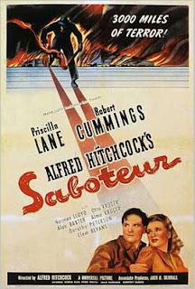
Saboteur (1942)


<><><><> <><><><> <><><><>
The Birds (1963)
I have noticed that the colour schemes of each of the poster are very dark which is suited to the genre and all of them contain red. This could provide the representation of blood, commonly used in posters for this genre and a convention which I may use myself. Text is kept fairly minimal with just the essential information on and the main bulk of each ooste ris made up of image. The images all contain people however the Vertigo poster has a silouhette of a person and I like this idea as it portrays a sense of mystery because we see no facial expressions or identity. I also like the shadowed effect used on Hitchcocks face in The Birds as this presents an evil or danger within the film. Overall I think I will keep my poster rather simplistic as Hitchcock has done although I sahn't be including an image of myself as Hitchcock has done as I feel that this can ruin the illusion of film making it less believable.